Enhancements Overview
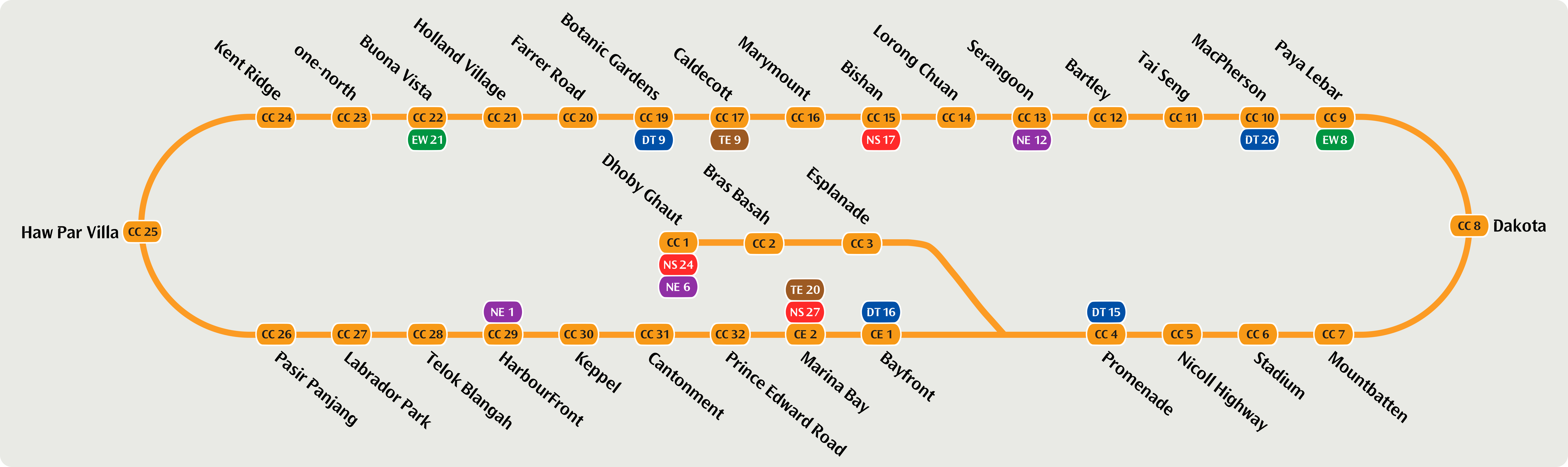
In 2026, the Circle Line Stage 6 (CCL6) expansion will include three additional stations. This development will complete the Circle Line, enabling full loop train services in both clockwise and anticlockwise directions. To enhance connectivity and provide a seamless commuting experience, new features such as improved signage, passenger information displays, and audio announcements are being introduced.
I will showcase my redesigns in different parts, as follows:
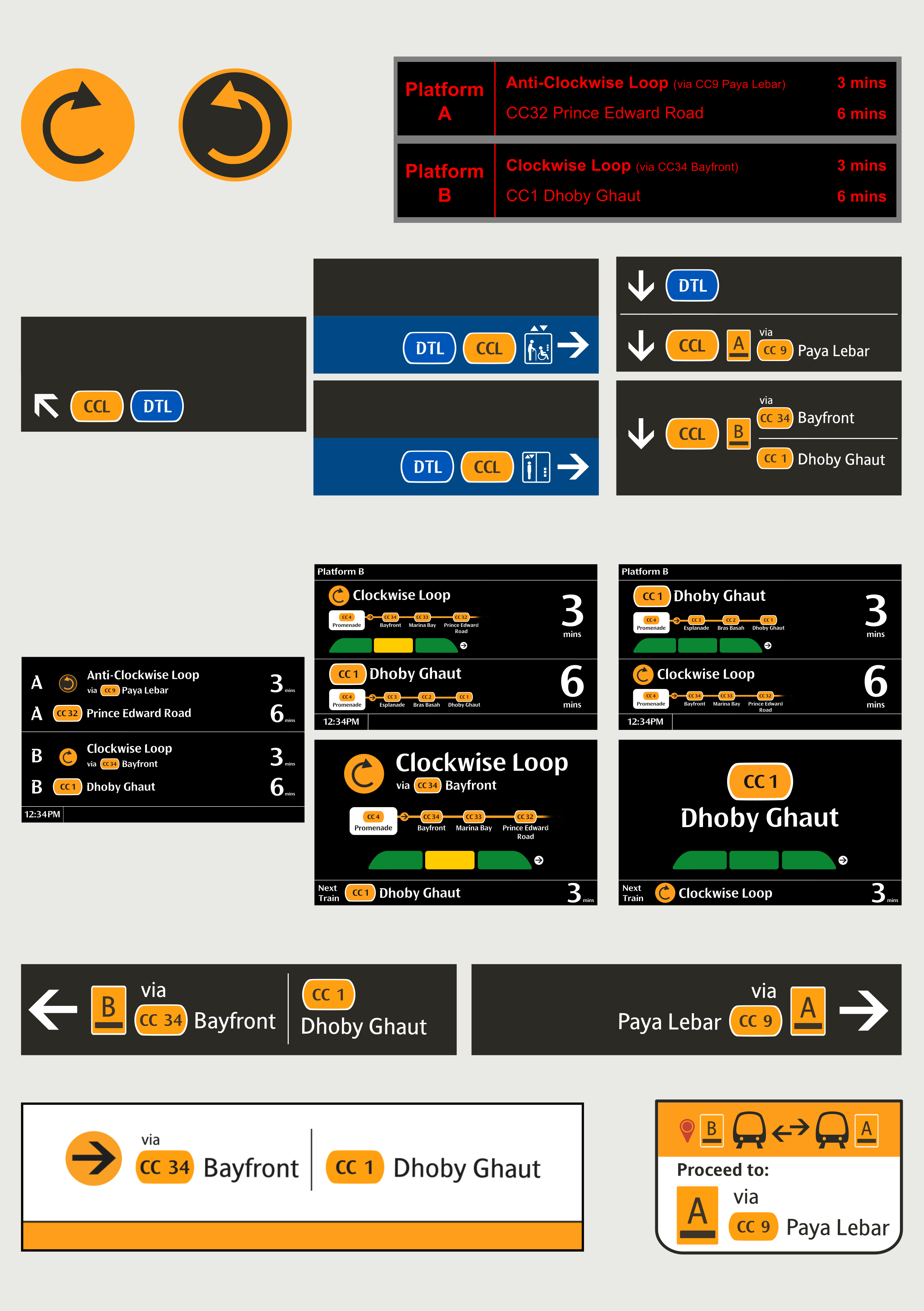
Do note that for all my ideas, I'll be going with the Clockwise/Anti-Clockwise Loop naming conventions, Single Caplet without Interchange and 'Towards' being changed to 'via'. Also note that the Train Load Indicator is not confirmed to be implemented, but my designs have made that a consideration as well.
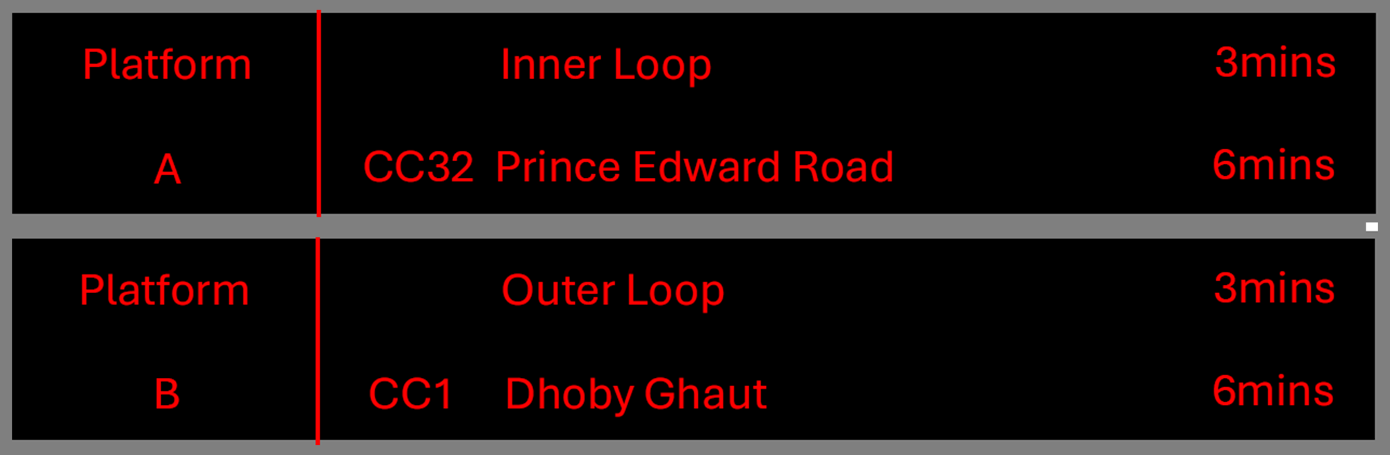
• Platform Information (Platform A/B)
• Train Service Route (Inner/Outer Loop)
• Station Code for non-loop service trains at terminal stations (eg. CC32)
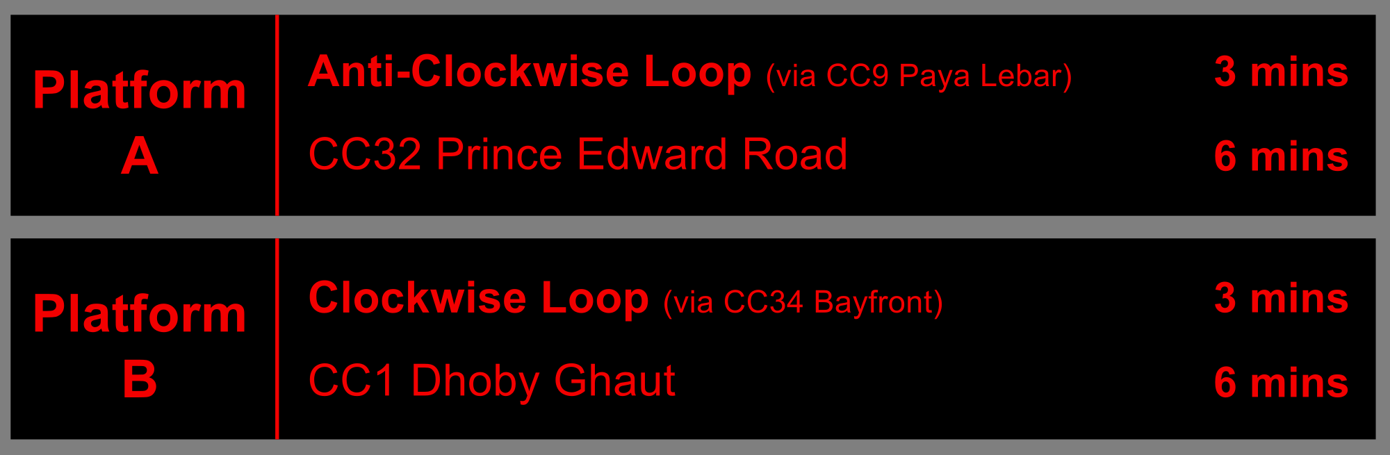
• Platform Information (Platform A/B)
• Train Service Route
(Clockwise/Anti-Clockwise
Loop)
• Station Code for non-loop service trains at terminal stations (eg. CC32)
• Addition of Bold
Formats to selected Texts
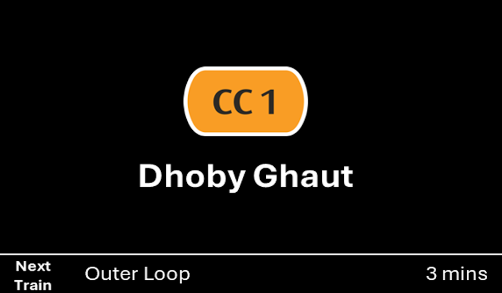
Proposed Design by LTA
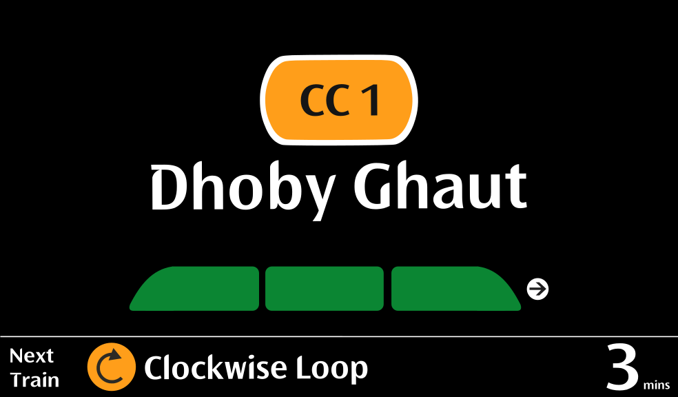
My Redesigned Version
• Black background
• Simplified icons and elements
• Concise descriptions
• Station name abbreviation and caplets instead of a colour band
• Black background
• Simplified icons and elements
• Concise descriptions
• Station name abbreviation and caplets instead of a colour band
• Blue Background for
signages leading to
Lift
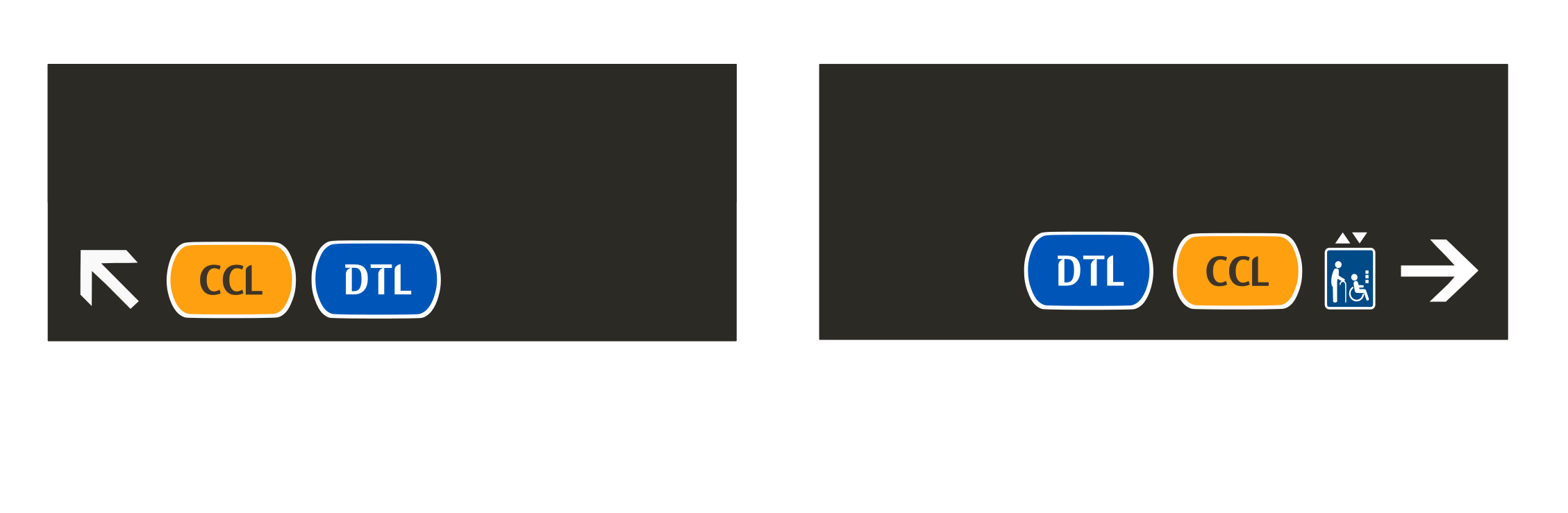
Proposed Design by LTA
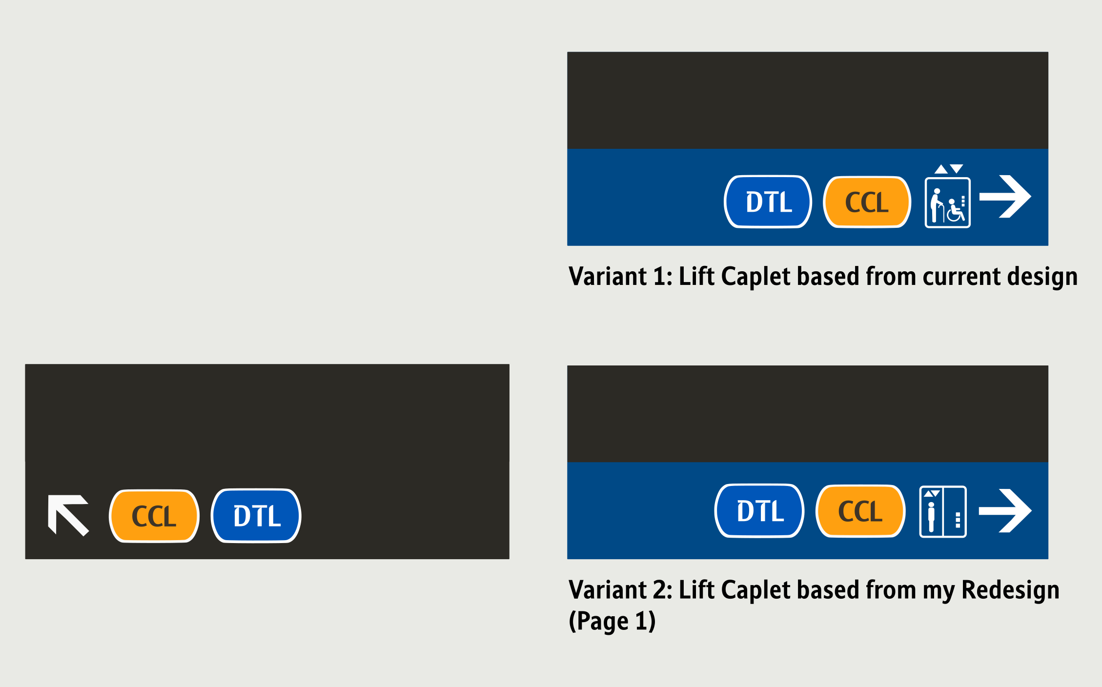
My Redesigned Version
• Black background
• Single coloured caplet with station codes for non-loop services
• Indication of train service direction - towards <-- next interchange station --> for loop services
• Black background
• Single coloured
caplet with station codes for
non-loop services & interchange stations to save space
• Indication of train
service direction - via
<-- next interchange station --> for loop services
• UI is matched exactly to the ones found in TEL
Proposed Design by LTA
My Redesigned Version
Option 1
• Show towards <-- next interchange station --> to indicate direction of train service
• Display interchange colours
Option 2
• Display only Circle Line colour and station code
• No interchange colours
Option 3
• Display only Circle Line colour and station code
• Removed "CCL" Caplet - relying only on the colours, platform ID and towards < next interchange
station>
• Only “DTL” caplet to indicate a different line
Option 2
• Display only Circle Line colour and station code
• No interchange colours
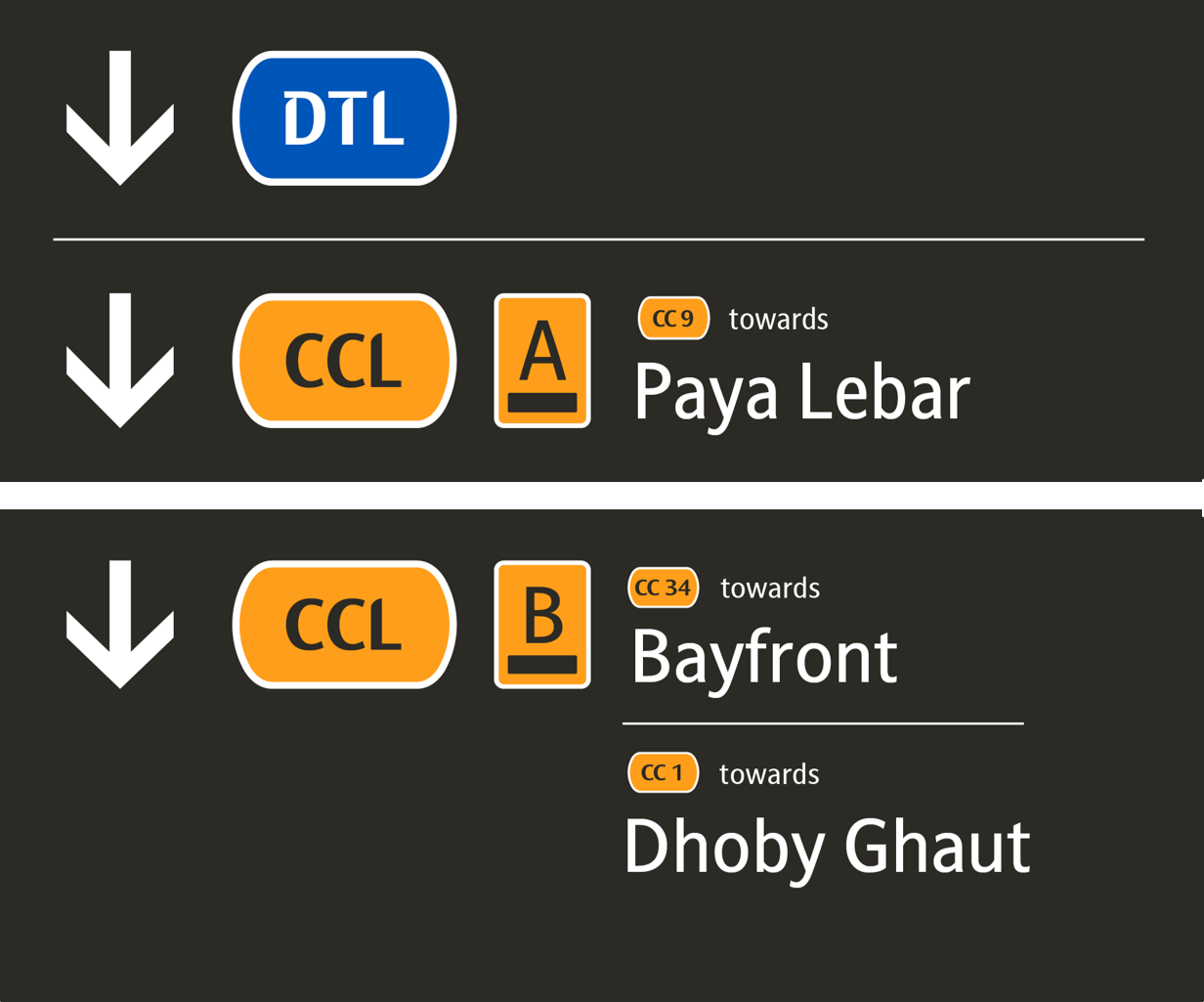
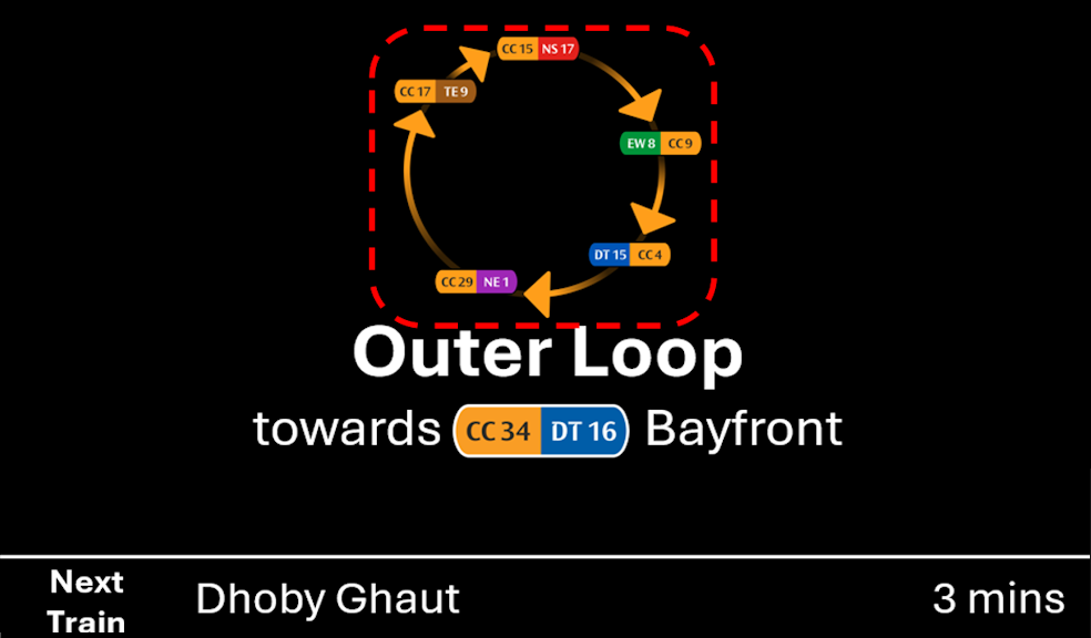
Proposed Design by LTA
My Redesigned Version
Option 1
• Full display of all CCL stations
• Applying half circle fade-out approach to suggest shortest route to the listed stations. Faded
sections indicate longer travel time
• Header to show respective Platform ID and next interchange caplets and colours (e.g. CC34|DT16
towards Bayfront)
Option 2
• Full display of all CCL stations
• Applying half circle fade-out approach to suggest shortest route to the listed stations. Faded
sections indicate longer travel time
• Header to show respective Platform ID and next interchange caplet
and in a single colour (e.g.
CC34 towards Bayfront)
• No interchange colours
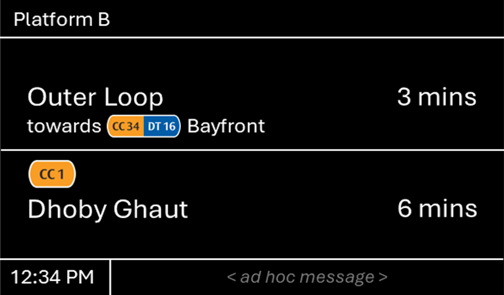
Option 2
• Header to show respective Platform ID and next interchange caplet and in a single colour (e.g.
CC34 via Bayfront)
• No interchange colours
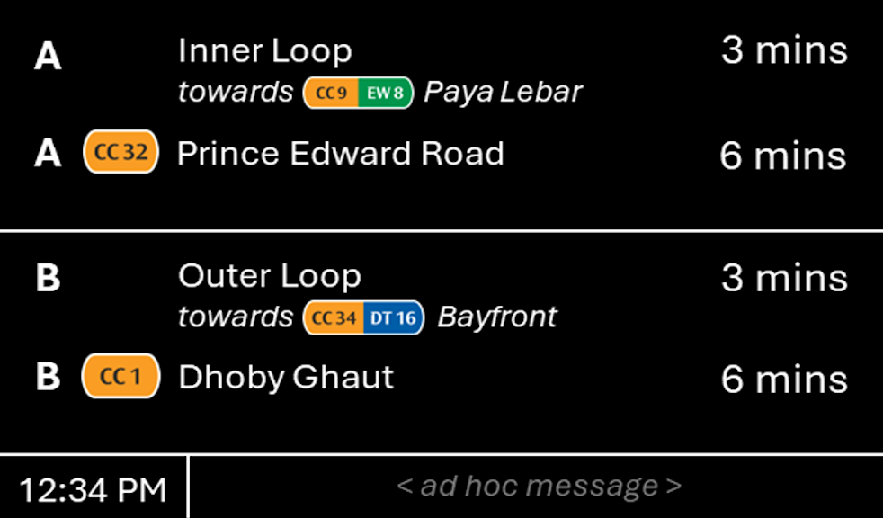
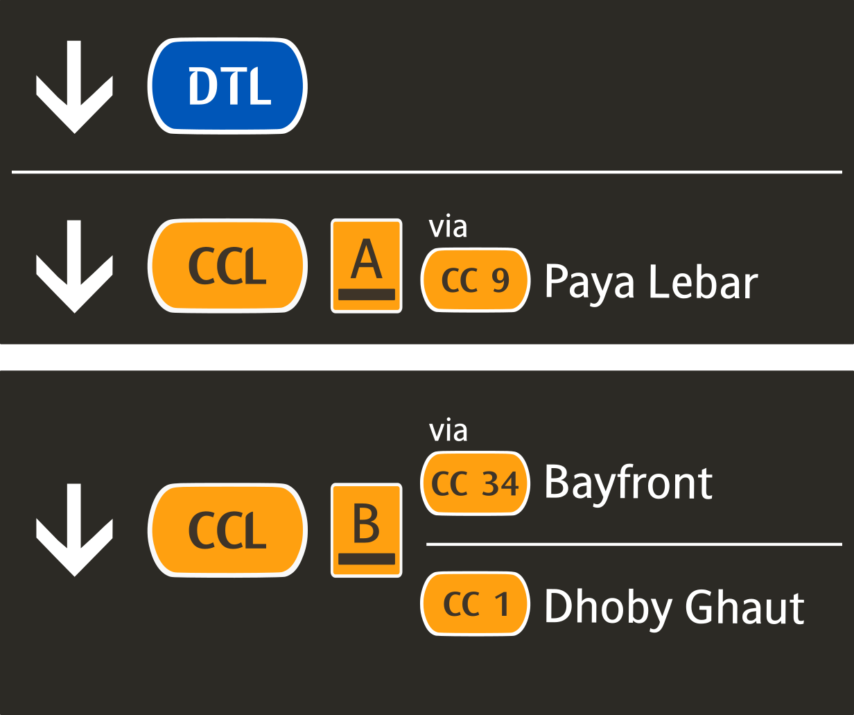
Proposed Design by LTA
My Redesigned Version
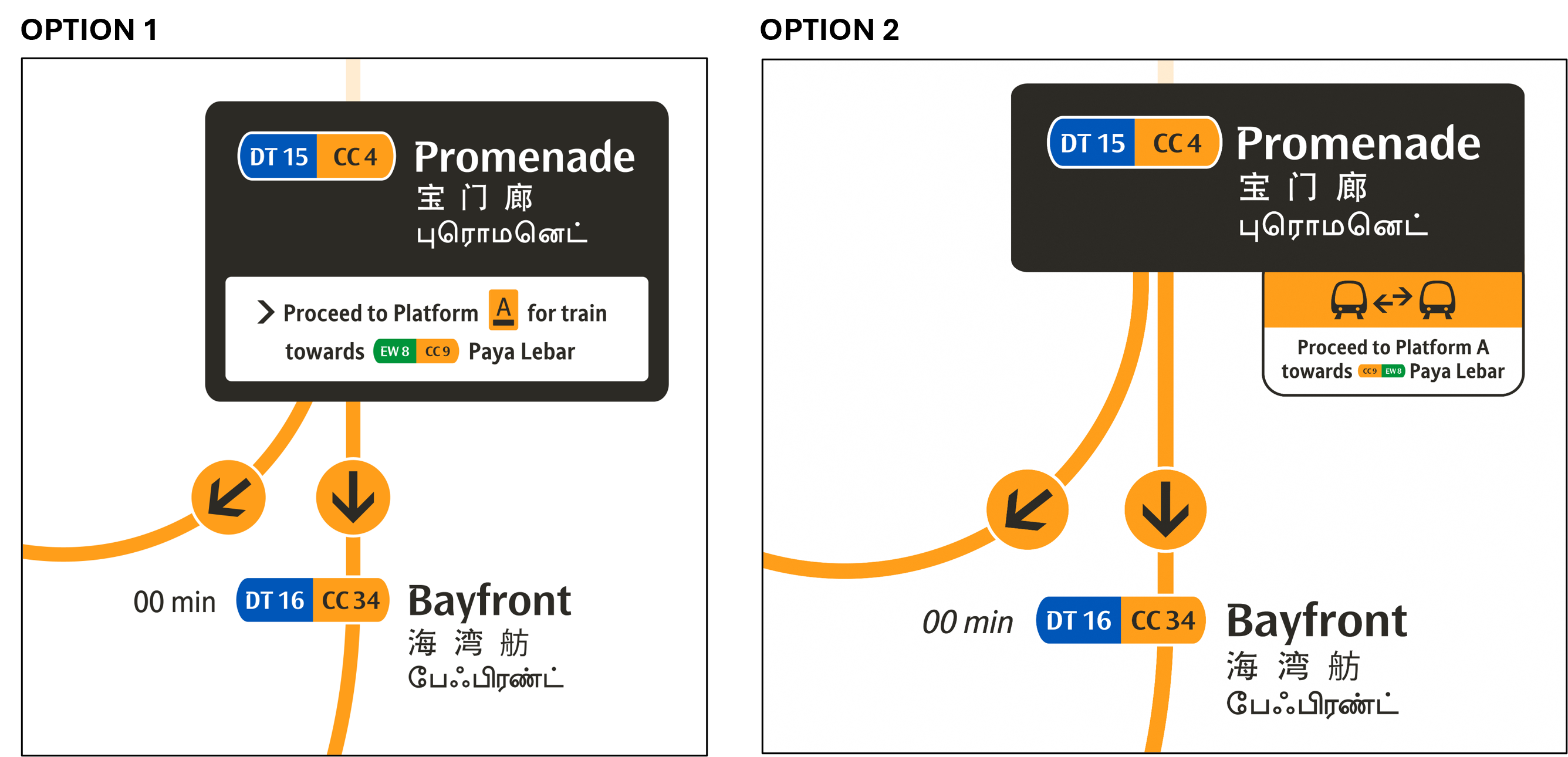
Option 1
• Within a text box
• Indicates Platform ID and the respective towards <-- next interchange station --> information
Option 2
• Displayed as a tab
• Only indicate towards <-- next interchange station --> information
• Includes transfer icon
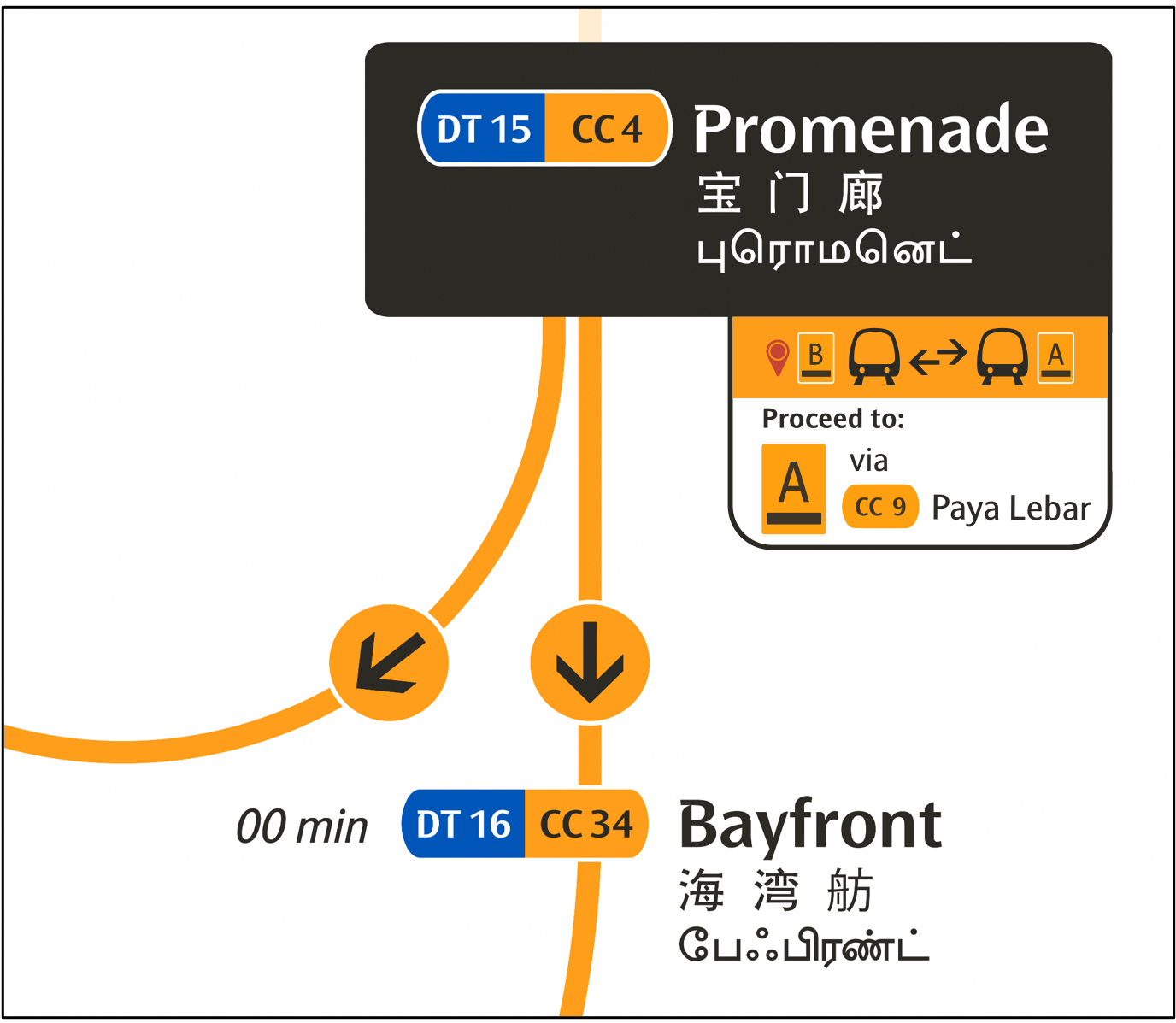
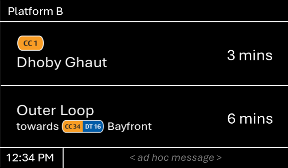
Option 2
• Displayed as a tab
• Only indicate via <-- next interchange station --> information
• Includes transfer icon
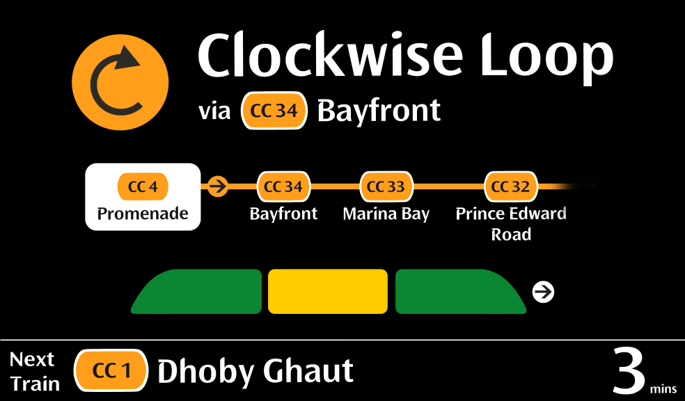
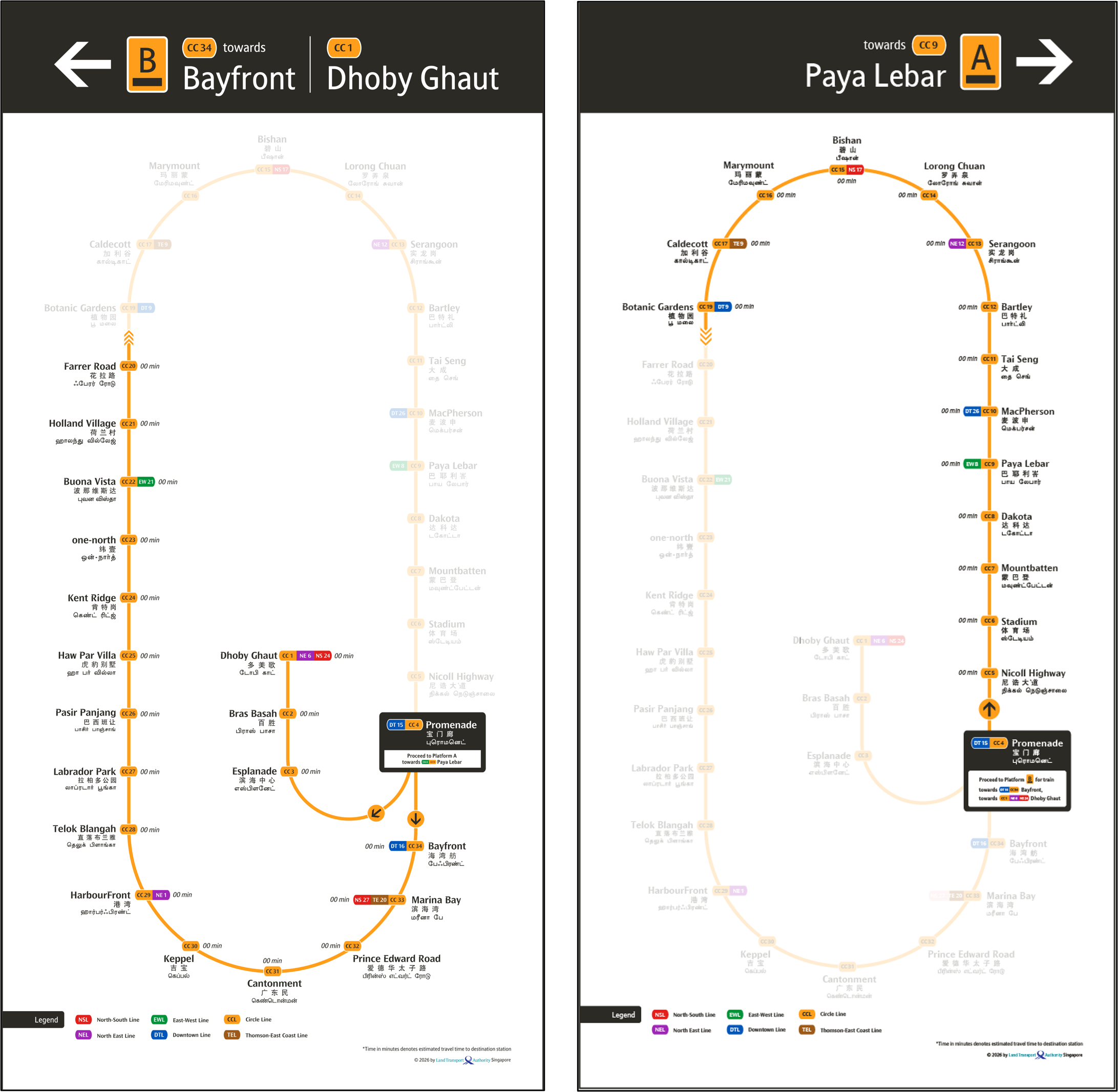
Proposed Design by LTA
My Redesigned Version
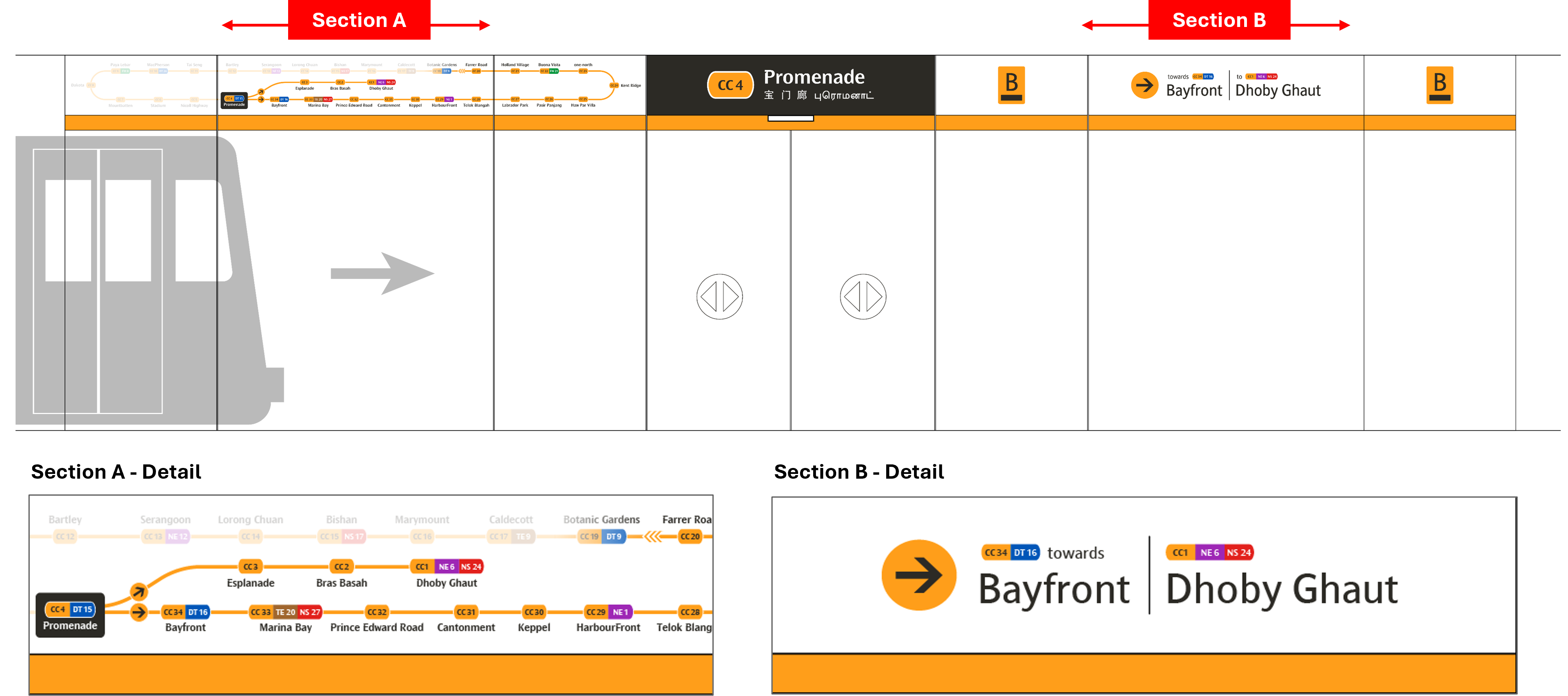
Option 1
• Full display of all stations on Circle Line
• Applying half circle fade-out approach to suggest shortest route to the listed stations. Faded
sections indicate longer travel time
• Indication of train service direction - towards <-- next interchange station -->
• Section B - Double liners with interchange-coloured caplets
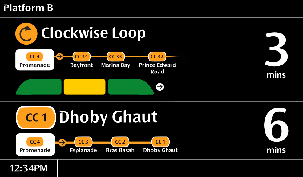
Option 2
• Full display of all stations on Circle Line
• Applying half circle fade-out approach to suggest shortest route to the listed stations. Faded
sections indicate longer travel time
• Indication of train service direction - towards <-- next interchange station -->
• Section B - Single liner with CCL-coloured caplets
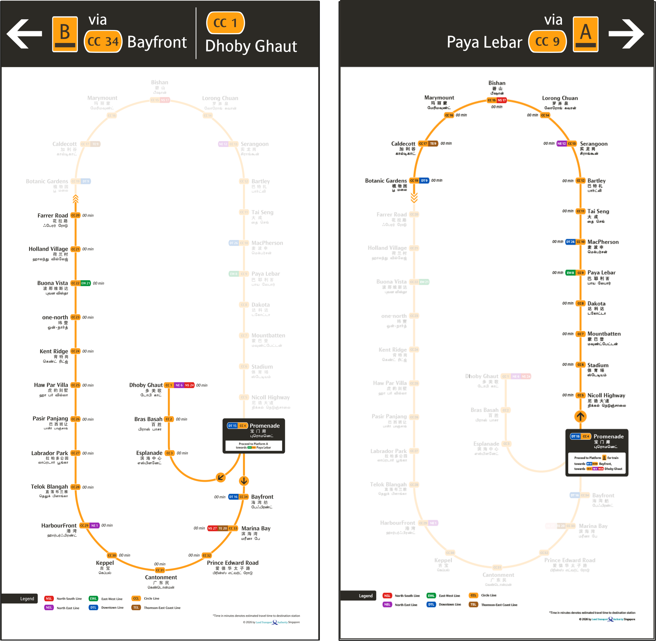
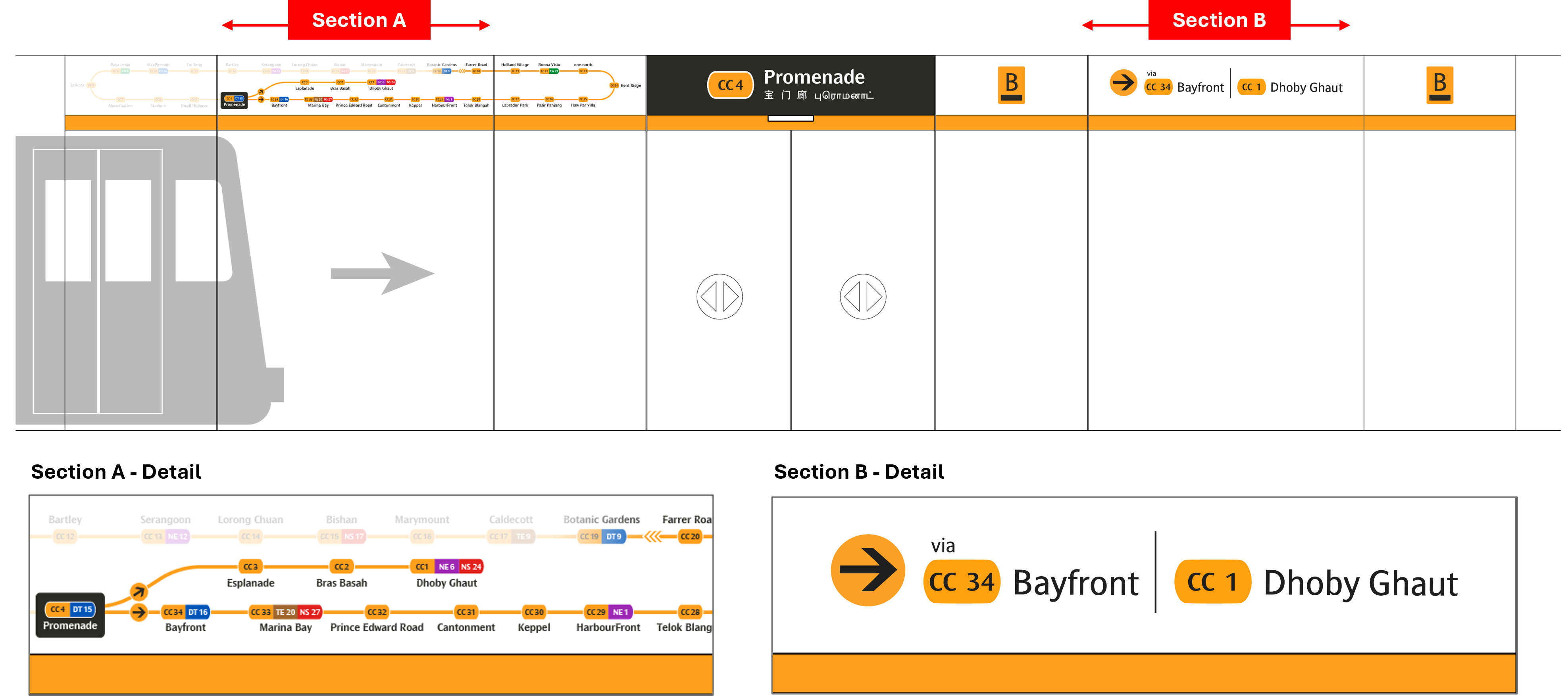
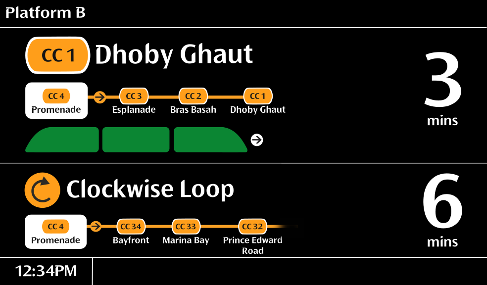
Option 2
• Full display of all stations on Circle Line
• Applying half circle fade-out approach to suggest shortest route to the listed stations. Faded
sections indicate longer travel time
• Indication of train service direction - via <-- next interchange station -->
• Section B - Single liner with CCL-coloured caplets
Proposed Design by LTA
My Redesigned Version
Proposed Design by LTA
My Redesigned Version
Proposed Design by LTA
My Redesigned Version
Proposed Design by LTA
My Redesigned Version