This is a continuation from the First Page which focuses on enhancements and iterations to the existing New Wayfinding system. This page aims to take a more experimental approach by exploring more Implementation ideas and how the new systems can be enhanced further.
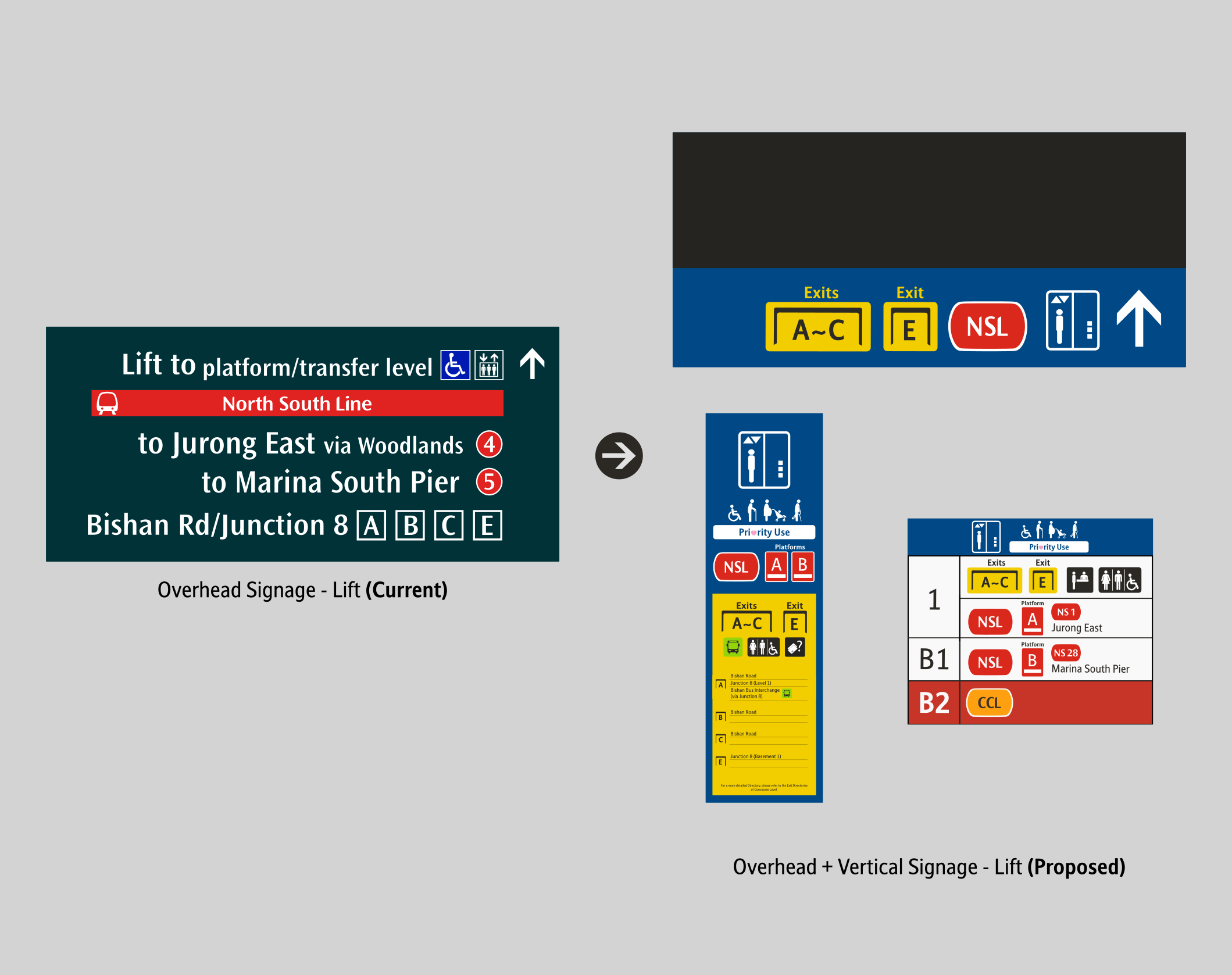
From feedbacks on the ground, many commuters didn't understand what "A with a Dash below" the "Gate" meant. Those descriptions actually refers to the Platforms and Exits respectively. To make it clearer, an 'Exit'/'Platform' label has been added, and it is now mandatory to be added. Current implementations saw the labels at the top for Exits as temporary (stickered on at a later part, and not integrated into the design.)
It's time to let the Dark Green Background retire. Previously used on backgrounds of Station Name signages, it progressively got replaced with a darker shade of Grey. The current implementation uses a combination of both Dark Green and Dark Grey, hence I have decided to only stick with just the Dark Grey colour across all signages.
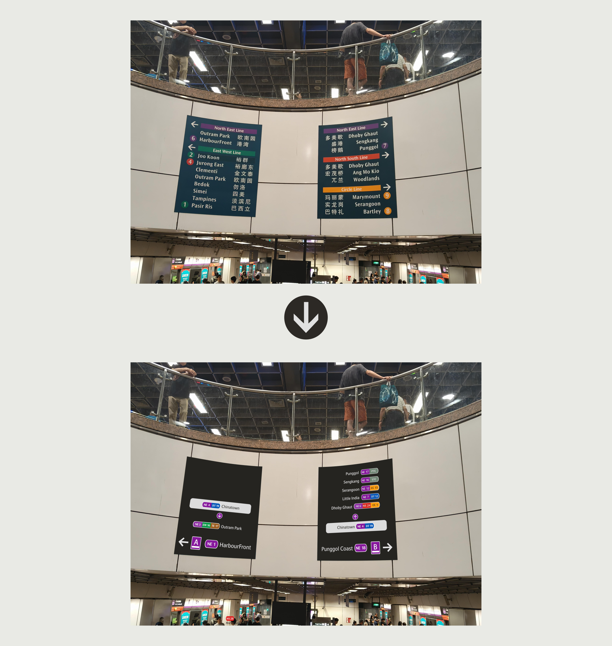
The Street Names on the Overhead signages were removed in
the New Wayfinding System. While it is understood that the
removal of the Street Names was to make the signages more
simplified, I believe there is a better way to still fit them in the
new system.
The Street Names will appear when there are only 1 or 2 exits
ahead. For multiple exits, the same principle currently being
implemented will apply here. To make up for the loss of
information, a separate wall Vertical Wall Signage will be
pasted instead.
The implementation of the Main Exit Sign in Punggol Coast gives us a glimpse of how they would label exits. Yes, it's just putting the Exit Numbers there and calling it a day. The rest are all empty spaces. Hence I proposed adding on more icons on the signage - just the icons. If Commuters need more details, they can refer to the Signage on the Wall.
📸: yuirbanfantasy (via X)
With LTA's vision of simplifying overhead
signs they removed useful information like
Street Names. Same concept as previously
mentioned, to compensate for the loss of
major information, on the overhead signage,
a separate wall Vertical Wall Signage will be
pasted instead.
For Platform Directions, I utilized the Floor
Indicator Signage, while the Street Name
information has been integrated in the
summarized Exit Directory as shown earlier,
into the lift signage.
My end goal for doing so is to offload the
information from the Overhead Signage to ta
more strategic place, such as the empty wall
spaces.
Some signages got stuck in time. It is either
those signages have been forgotten, or it is
simply not feasible to constantly update,
hence it was lat updated when Circle Line
Stage 2 commenced service. It has not
gotten an update ever since.
I considered giving the signages a fresh
redesign, while adding on the newer lines
but I felt that it could get too cluttered.
Hence, I've decided to list down the North
East Line's Key Interchanges instead. It will
be easier to update in the long run.
The different Brainstorming of Designs are a compilation of ideas from my Train Rides over the years, ever since the new Wayfinding System was introduced. You may notice many of the designs are catered for the Train's side of things. This is because whatever that is suggested can be easily re-applied for the Buses side of things as well.
"Achieving consistency and replacing all signage across the country overnight is very challenging. While we wish to do so, it requires time, manpower, and careful planning. Compared to metro systems overseas, some signages also differ slightly, such as those of Taipei Metro and MTR."
Hence this microsite could be useful in diving in and exploring different ideas that can be used to make the wayfinding system better. Whether the ideas worked in real-life or not, is a different story. Well, if you have not tried, you will never know! This microsite is an extension to my Blog Posts, which can be found below!